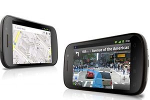
NEW DELHI: In the world of Google’s Android phone operating system, new phones seem to fall down the chimney once a week, each leapfrogging the last in desirability.
 The Nexus S is particularly intriguing, because Google designed it. Not just the software this time, the phone itself. Yes, “Google” is painted right on the back, along with ” Samsung,” which did the manufacturing. This phone, the Nexus S, bears little resemblance to Google’s first effort at a phone a year ago, the failed Nexus One. (The Nexus S has more in common with Samsung’s Galaxy S models.)
In general, the new Nexus is much the same as its rivals: it’s a black rectangle (bigger than the iPhone in every dimension) with a multitouch screen, an on-screen keyboard and a superfast chip that makes everything feel responsive.
The back panel camera has an LED flash, but the quality is only average and it can’t take hi-def videos. The 4-inch screen is bright, sharp and vivid. The case is all plastic, which makes it more of a scratch-and-fingerprint magnet than the glass-and-metal iPhone.
It’s sleek but fairly generic-looking; the only design eccentricity is a bulge on the lower back that, you could argue, helps you orient the phone when extracting it from your pocket. Storage is capped at 16GB — only 1GB of which is available for storing standard downloaded apps.
The most attractive aspect of the Nexus S may not be the hardware at all, it’s the software. Here is pure Android, the way Google intended it. No cellphone maker has tweaked, diluted or complicated it with customisations. It doesn’t come with preinstalled junkware apps. And it’s the first phone with Android 2.3 (codenamed Gingerbread).
The 2.3 update offers a motley assortment of enhancements: a lovely, dark color scheme, threaded call logs (back-and-forths with each person are listed together), a new page that lists all downloads, a breakdown of what’s been using your battery and memory. The battery life is much improved. It should easily get you through a day, maybe even two, between charges.
Meanwhile, you still get all the spectacular core Android features: a GPS app complete with spoken directions, a microphone button on the keyboard that lets you dictate text anywhere you can type, and seamless integration with Google’s own products, like Picasa, Gmail and Google Voice.
Of course, you also still get all the problems of Android: namely, a degree of chaos. This, of course, is the blessing and the curse of Android’s openness. That’s why, for example, you get one programme for Gmail accounts, and another for regular email.
That’s also why the Android 2.3 improvements in Copy and Paste have dubious value. The Copy and Paste mechanism is different in each program, and even on each Web page. If you choose an iPhone, you get a totally different philosophy: a gated community, controlled, but 100 percent clean and consistent.
The Android world is more chaotic, less controlled. The phone companies can rewrite the look, feel and features of Android if they like. Programmers can create any apps they like, even those that Apple would reject for being pornographic or anarchic.
If you prefer Android’s approach, then your day just got a lot brighter. No, the Nexus S isn’t perfect. But it’s among the very best Android phones, and it will be for the next couple of weeks at least.


