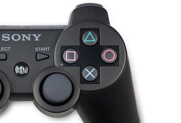
This is pretty interesting. I’ve always thought that the shapes on the Playstation controllers were chosen just to be distinctive, and so they didn’t have to use a numbered or lettered face button scheme like Nintendo’s. As it turns out, they were picked for good reason. Sony’s Teiyu Goto explains:
Other game companies at the time assigned alphabet letters or colors to the buttons. We wanted something simple to remember, which is why we went with icons or symbols, and I came up with the triangle-circle-X-square combination immediately afterward. I gave each symbol a meaning and a color. The triangle refers to viewpoint; I had it represent one’s head or direction and made it green. Square refers to a piece of paper; I had it represent menus or documents and made it pink. The circle and X represent ‘yes’ or ‘no’ decision-making and I made them red and blue respectively. People thought those colors were mixed up, and I had to reinforce to management that that’s what I wanted.
I grew up with Super Nintendo, so I still think of the diamond-formation buttons as A, B, X, and Y (and have to communicate them as such – “hit X! No, the SNES X!”), but it’s nice to know that there was some reason behind the shapes and colors.
The whole little article is worth reading. When you’re designing the fundamentals of a new franchise, it pays to play it simple and have good reasons for everything you do.


