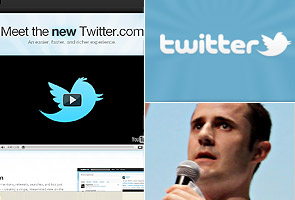
New York: Twitter unveiled a new Web site on Tuesday that it hopes will be user friendly.
 The redesigned site, which will be available to all users in the next few weeks, makes it simpler to see information about the authors of Twitter posts, conversations among Twitter users, and the photos and videos that posts link to.
“It’s going to increase the value that people are getting out of Twitter, so in less time you can get more information and value,” Evan Williams, Twitter’s co-founder and chief executive, said in an interview. He had the idea for the redesign and has spent much of his time in the last few months working with Twitter engineers on the site. He has said he was surprised that so many people use the service — 160 million — given how difficult its Web site is to navigate.
That large audience is appealing to advertisers, but the unappealing Web site has not been a welcoming place for them. Twitter, which has raised $160 million in venture capital, has slowly started to run ads called Promoted Tweets that people see when they search the site. Mr. Williams said the new site would improve ads “because there’s going to be more real estate and more engagement.”
Twitter’s new Web site could threaten the many start-ups that build apps, like TweetDeck, Brizzly and Seesmic, to make Twitter easier to use and to provide users with more sophisticated tools.
Even though 78 percent of Twitter’s unique users gain access to the service through its Web site, the site has had some major flaws. Twitter has not been able to funnel resources into redesigning the site until now, Mr. Williams said, because the company has had trouble keeping up with its growth, even struggling to keep its Web site from crashing.
If people want to learn more about the author of a post, for instance, they must go to a new page. It has been almost impossible to follow a conversation between two Twitter users. And while a quarter of the posts contain links, if people post a link to a photo, readers have not been able to see the picture without going to a new site.
On the new Twitter Web site, people see two panes instead of a single timeline of posts. The timeline stays in the left pane. In the right pane, they can see more information about posts — like biographies of authors, photos and videos to which posts link — and conversations that spring from a particular post. This eliminates the need to click back and forth.
Mr. Williams said the new site was not designed for the sake of advertisers, but the experience of viewing ads would improve. For example, when a movie studio puts out a “sponsored tweet” for a film with a link to the trailer, users will be able to see the trailer without leaving the Twitter site.
Borrowing an idea from image searching on Google and Bing, Twitter now shows a continuous stream of posts so people do not need to click “more” to view additional posts.
Twitter, which was founded in 2006, has grown so quickly in part because it opened its technology to thousands of software developers outside the company who have built Twitter tools.
But as Twitter has matured, it has angered many of those developers by building similar tools itself or acquiring the start-ups that built the tools, limiting opportunities for competing app developers. Last spring, for example, it bought Atebits, which made a Twitter iPhone app called Tweetie, and turned it into the official Twitter for iPhone app.
Other start-ups worry that if Twitter builds its own tools, they will go out of business. Indeed, mobile Twitter users now reach Twitter through the company’s own iPhone and BlackBerry apps more than through any others, according to the company.
“We’ve made it pretty clear that we are going to create the best experiences we can with all our clients,” Mr. Williams said. “We made it clear to developers that it’s great for everyone if we make it as good as possible, because that will create more successful Twitter users.”


